Ratio'd
Translating complex analytics into interfaces creators can act on immediately
Ratio'd is a cross-platform analytics tool for content creators. It pulls data from Instagram, TikTok, YouTube, and Facebook into one place. But consolidating data isn't enough. Seeing your view count is interesting. Understanding why a video performed well, and how to replicate it, is valuable.
I designed the product from the ground up: design system, information architecture, and every feature from wireframe through interactive prototype. The core challenge was turning AI-generated analytics into direction, not just display.
A home base that surfaces insights, not just numbers
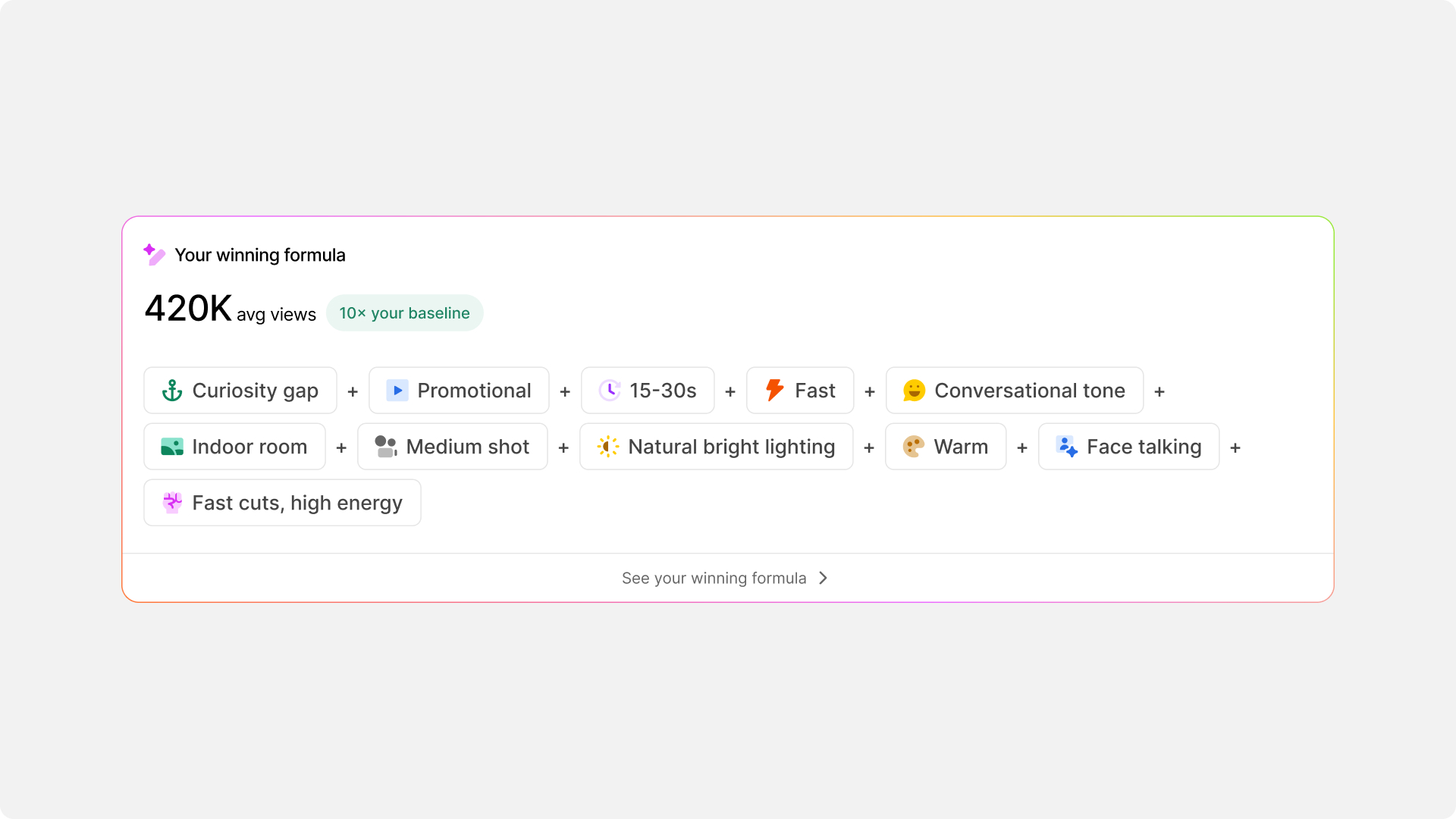
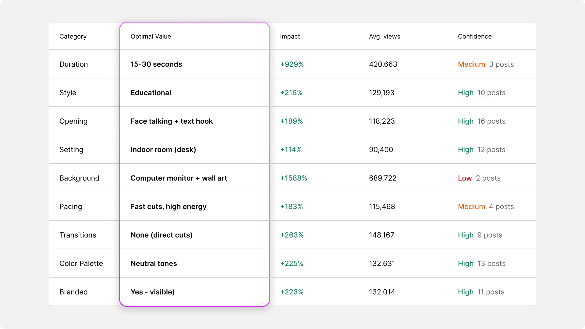
Winning Formula as scannable ingredient pills
Instead of a dense paragraph, the formula is broken into discrete pill components with a hero stat that anchors attention at the top. Recognition over recall lets creators verify their formula at a glance.
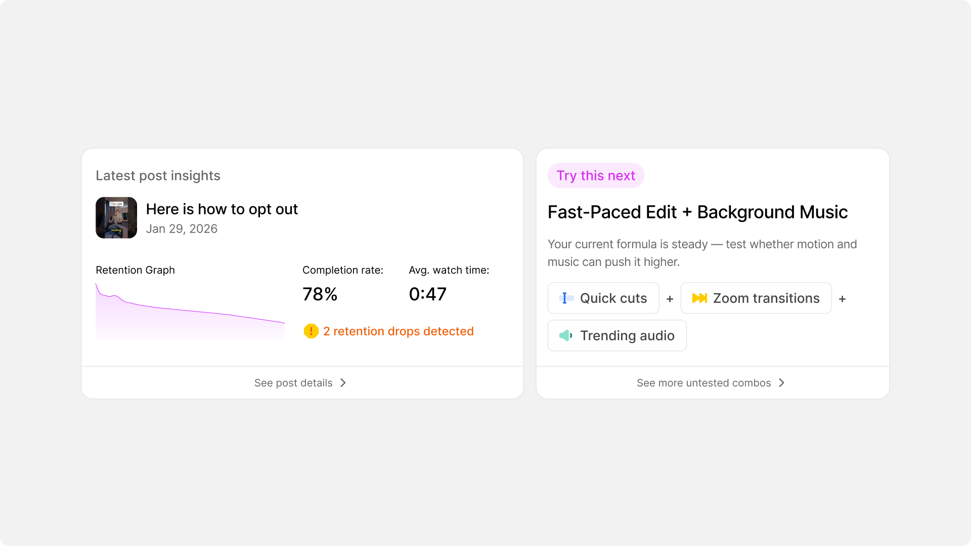
Latest post + Try This Next: specificity over vague labels
The retention sparkline communicates video health through shape alone. Loss aversion framing on retention drops motivates investigation. Try This Next replaces vague potential labels with specific tactics and estimated outcomes, reducing the perceived effort of experimenting.
One data model. Three connected surfaces. One shared visual language.
Ratio'd's algorithm detects dozens of attributes in every video and correlates them with performance. The design system uses the same conversational insight lines, color-coded badges, and slide-out panels across every surface, so the interaction patterns are transferable.
The Playbook
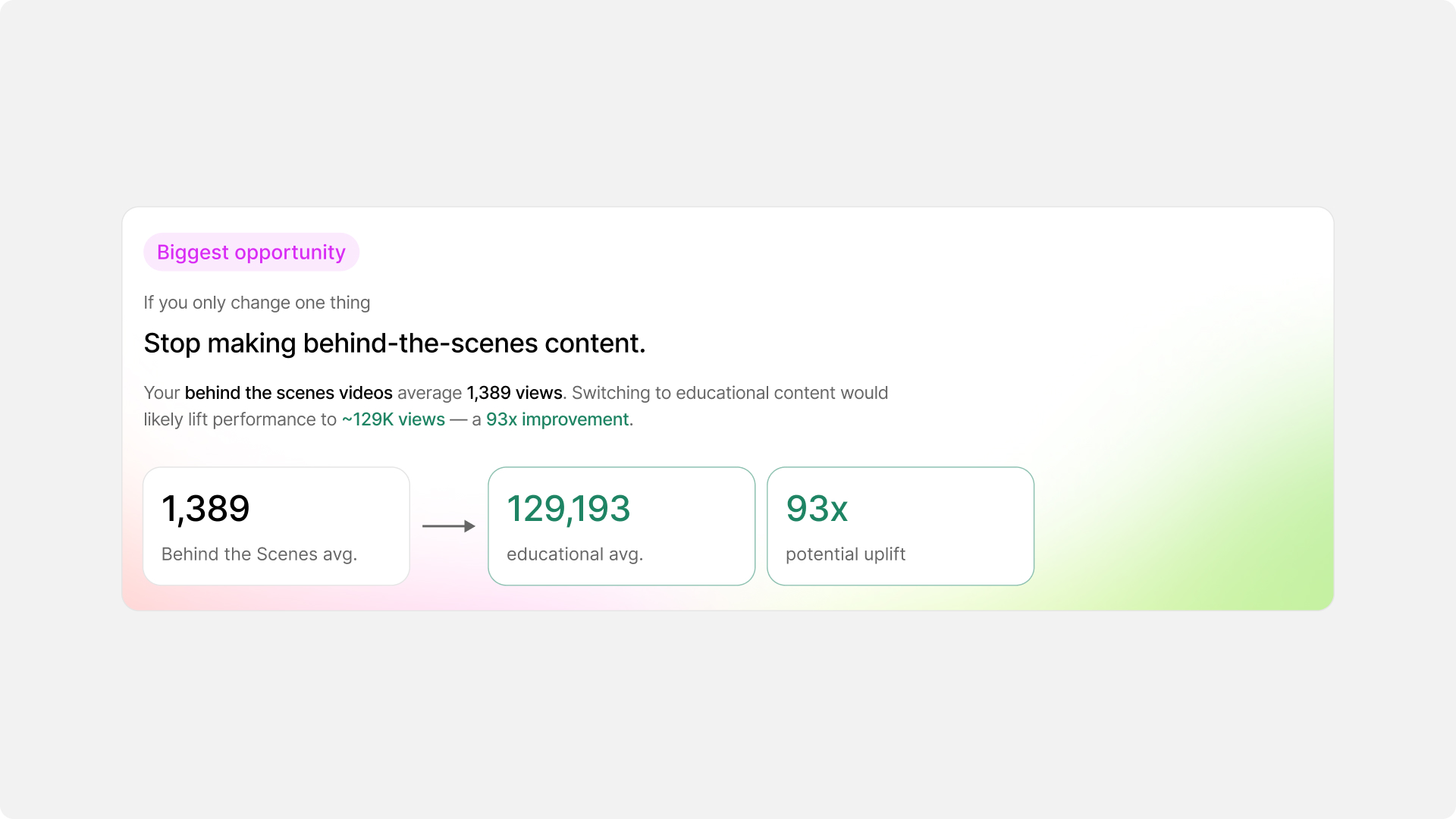
Biggest Opportunity: one insight, maximum impact
Isolates the single highest-impact change as one plain-English sentence with concrete numbers. Reduces decision paralysis by answering "what should I change first?"
Winning Formula: structured reference for repeat visits
Each row is clickable, opening a slide-out detail panel. Table format chosen intentionally because this is reference material creators return to repeatedly. Tables support comparison across rows better than conversational lines.
The Post Details Page
Conversational insights over data tables
Each factor is presented as a plain-English sentence with an impact badge. This matches how creators naturally think, not in correlation coefficients, but in statements they can immediately understand and act on.
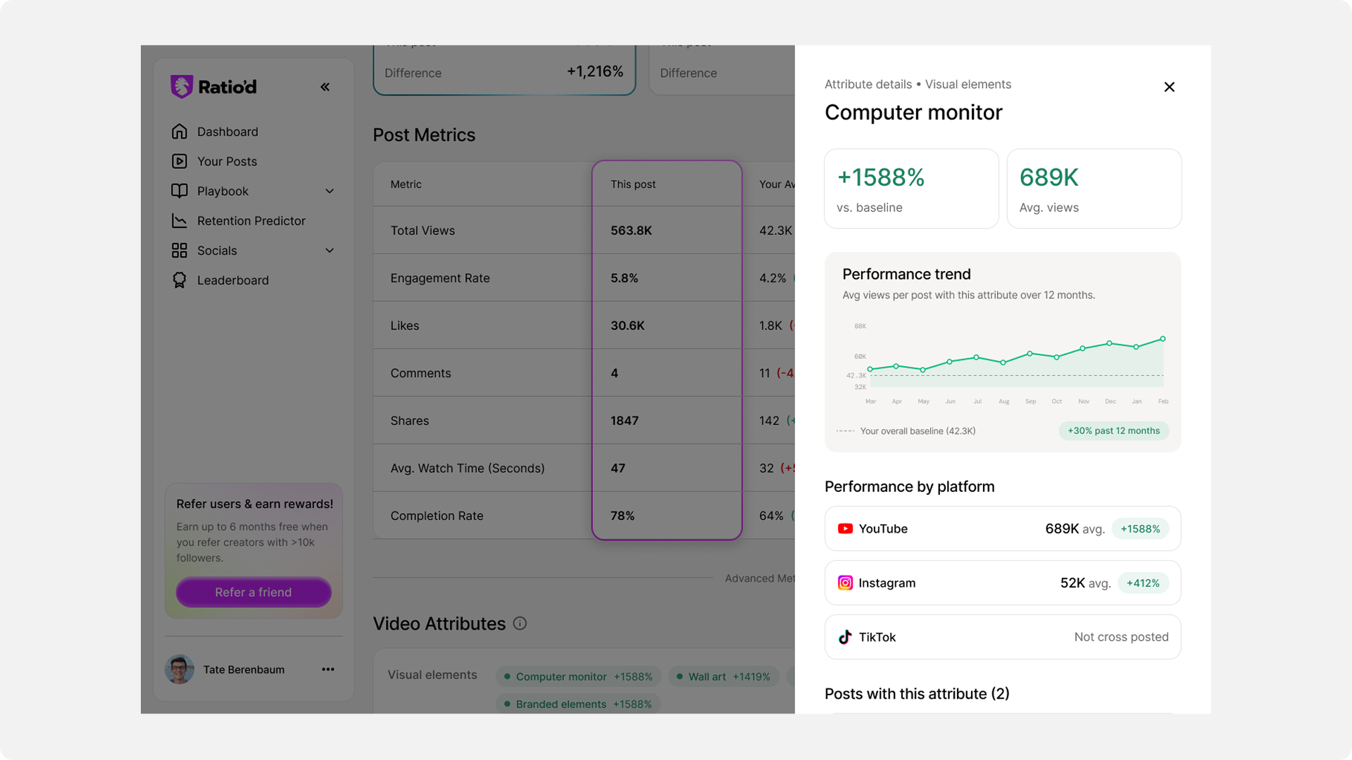
Attribute detail panel: depth without losing context
A clear information hierarchy: aggregate stats → trend chart → platform breakdown → matching posts. The platform breakdown shows how the same attribute performs differently across platforms. Absence of data is shown, not hidden, because it's meaningful information.
Analyze your video before posting, checked against your own winning formula
The algorithm generates a huge amount of feedback. It was all originally presented as equally-weighted text. The redesign imposed hierarchy. Scan first, read second.
Predicted retention curve: show where, explain why, suggest what
The retention curve shows creators exactly where viewers are predicted to drop off, but the graph alone isn't enough. Each drop zone is paired with an AI-generated explanation of why viewers leave at that moment and a concrete suggestion for what to change. The goal was to make every drop-off actionable, not just visible, so creators can fix problems before they publish.
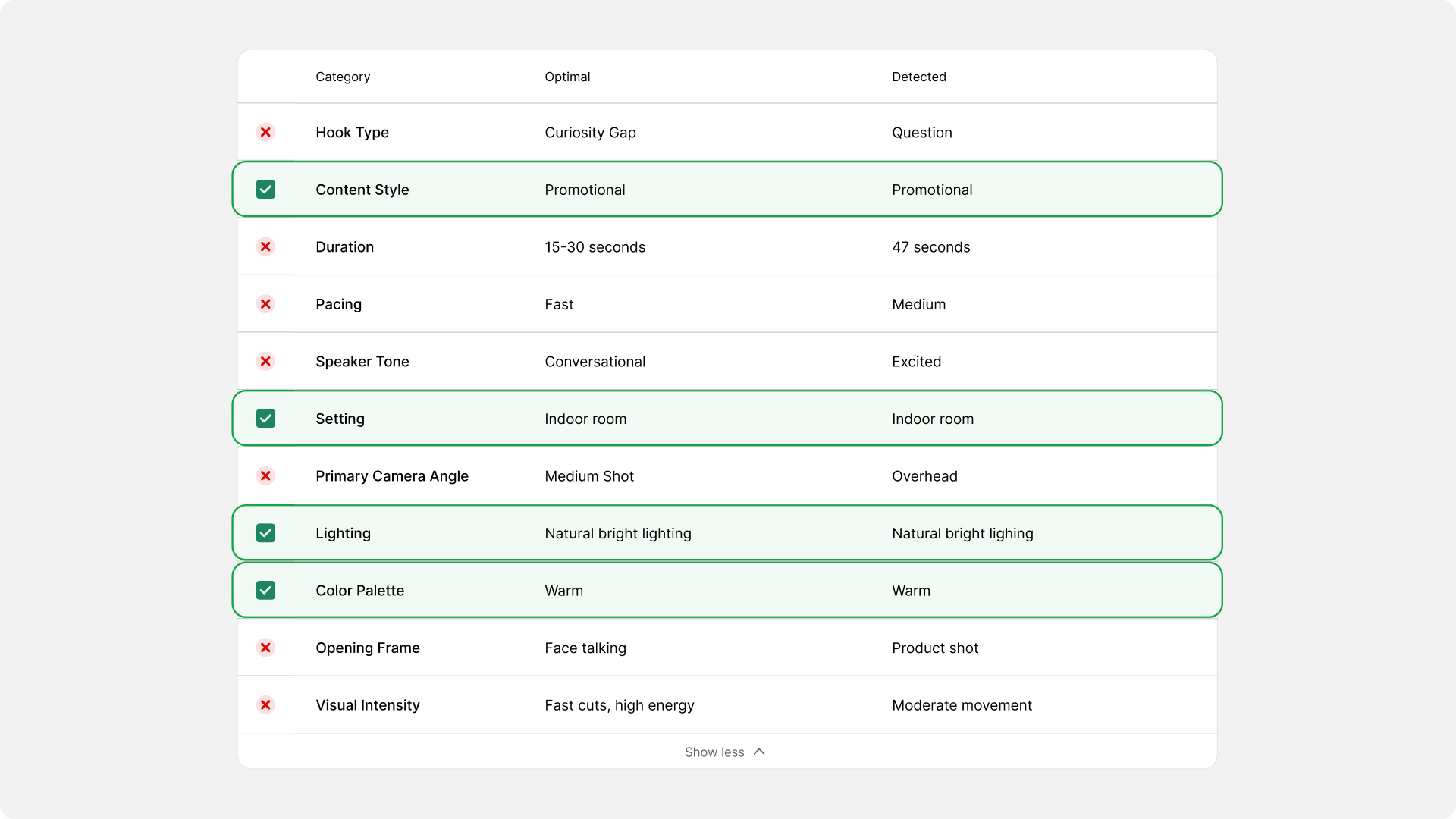
Content Checklist: how does this video compare to your best work?
The Content Checklist cross-references the uploaded video against the creator's historically top-performing content, surfacing whether the new video matches the patterns that have driven results. Binary pass/fail marks let creators spot mismatches instantly.
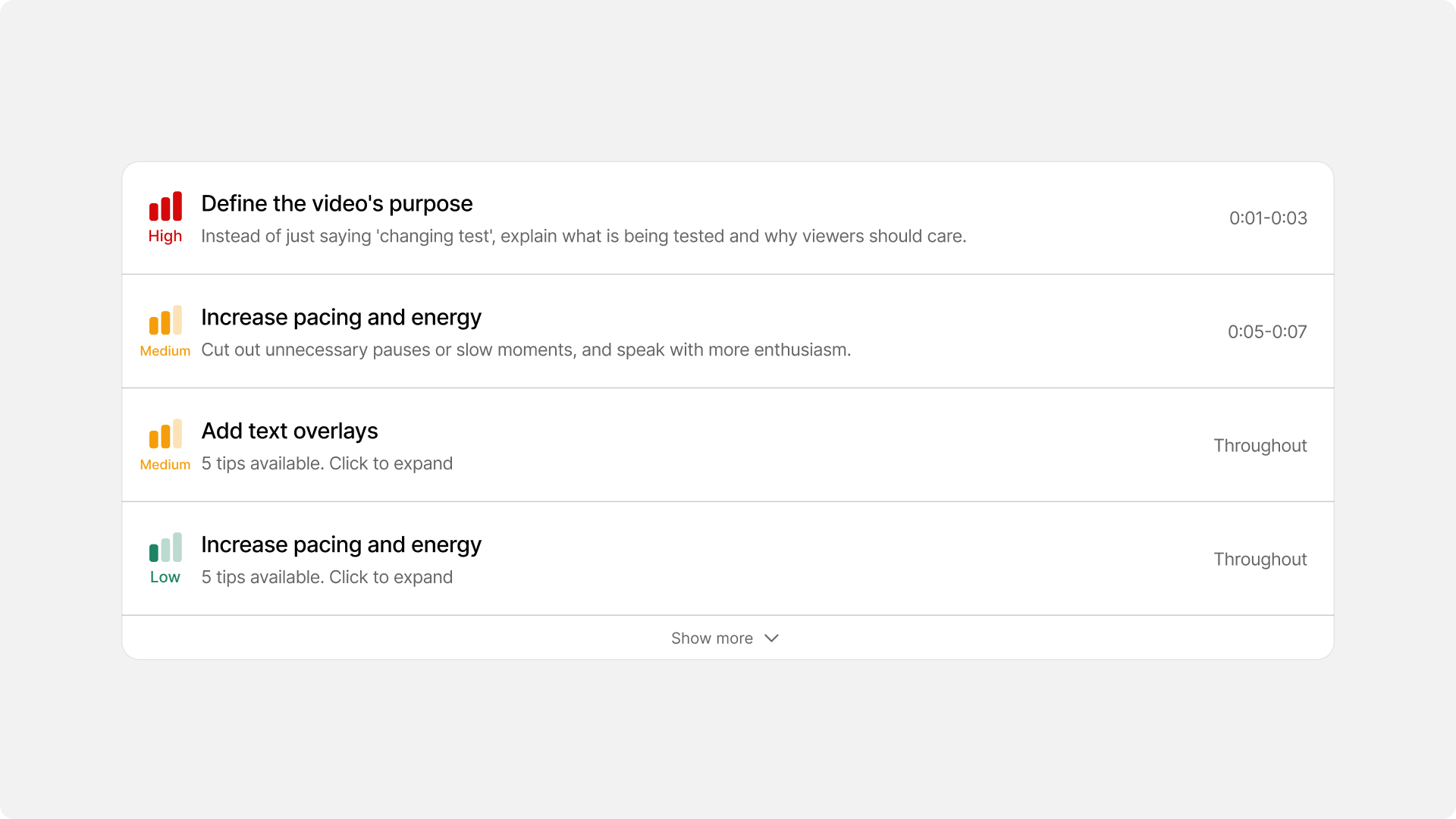
Suggestions organized by timeline
Signal bar icons replace text priority labels. Suggestions organized by video timeline to match the creator's editing mental model. Each collapsed card shows actionable feedback directly, no expanding needed to get value.
Where Ratio'd's brand personality comes through
Analytics tools have a retention problem. These features create daily and weekly reasons to come back, and they demanded a completely different design energy.
These were also my first contributions to a live codebase. I used Claude Code to build the animations for the posting streak and weekly recap, shipping directly to production. Designing and coding the same feature gave me full control over how the interactions felt, not just how they looked.
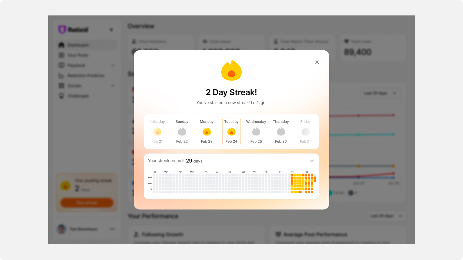
Posting Streak
A visual record of consistency inspired by GitHub's contribution graph. The intensity scale rewards cross-posting, reinforcing Ratio'd's core value prop through visual design:
Lowest possible streak threshold (any one platform counts). Designed for encouragement, not punishment.
Weekly Recap: Spotify Wrapped, every week
A shareable carousel celebrating the creator's week. This is where the brand gets loud: iridescent gradients, bold outlined display type, and sparkle iconography replace the clean analytical UI.
- Social-native visual language: Outlined display type and gradient backgrounds reference Instagram Stories and Spotify Wrapped, making slides feel native to the platforms creators live on
- Each slide works as a standalone screenshot: Data large enough to read at thumbnail size, branding present but not overpowering
- Platform-aware colour coding: Instagram purple-pink, TikTok cyan, YouTube red across all slides
- Share-first hierarchy: The Share button is the most prominent modal action
- 16:9 and 9:16 exports: The share target determines the format
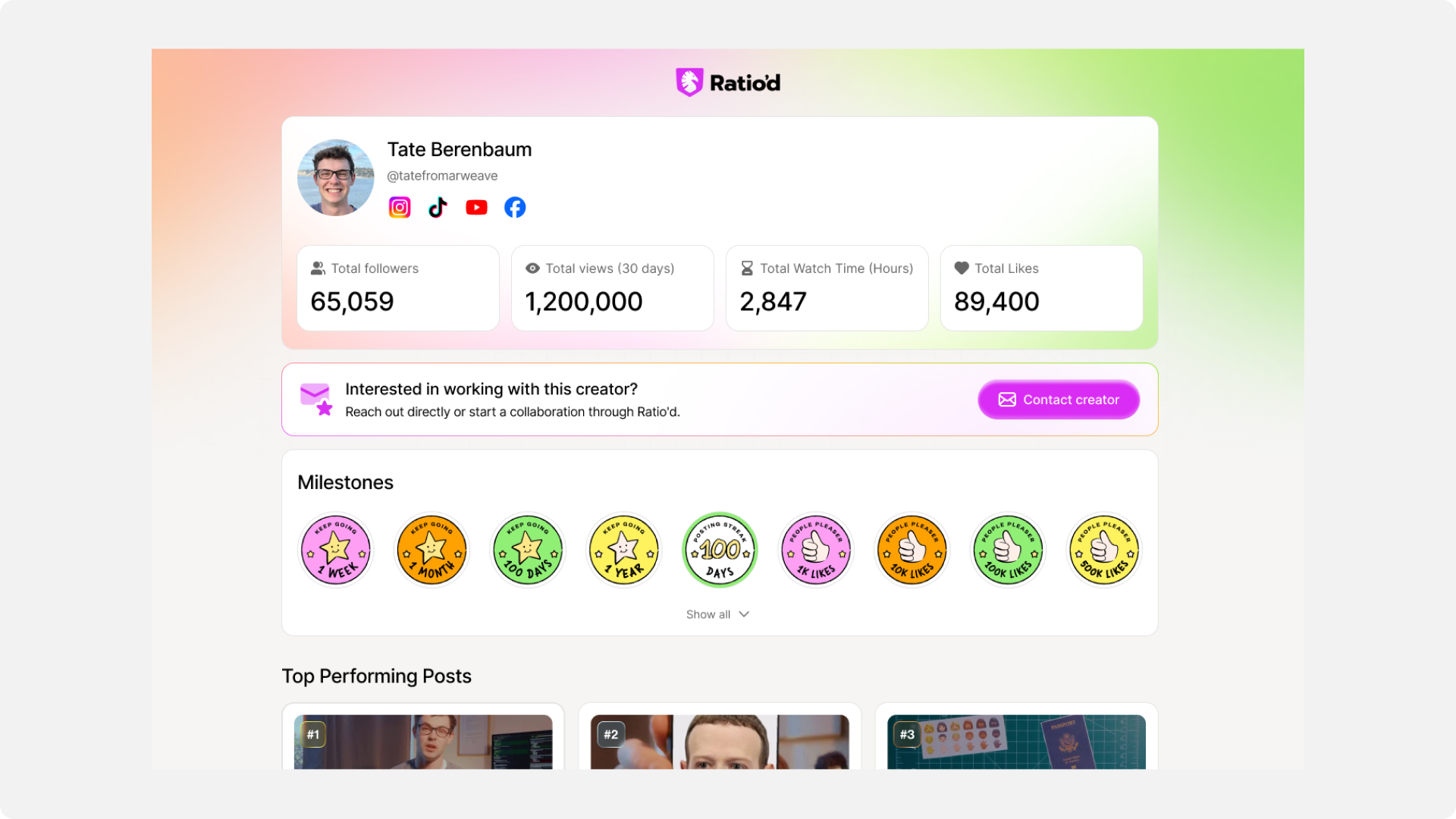
Achievement Badges: motivation meets trust signals
Warm, hand-drawn illustration style contrasts with the precise analytics UI. Gold palette for streak badges, purple-pink for engagement milestones. For creators, they're motivational. For brands evaluating a profile, they're trust signals.One design element, two audiences.